


Color in Your Dreams
The Recap 8/12-8/18/24

This week on the website- the Albert Frey exhibition in Palm Springs, Modernism, Luis Barragán and “emotional architecture”, the importance of color, Terence Gower, Haim Steinbach, a poem about writing and painting, and more-
First- Music Monday’s Song of the Day this week was Drummy from Justin R. Cruz Gallego aka J.R.C.G.’s 2024 album Grim Iconic…(Sadistic Mantra).
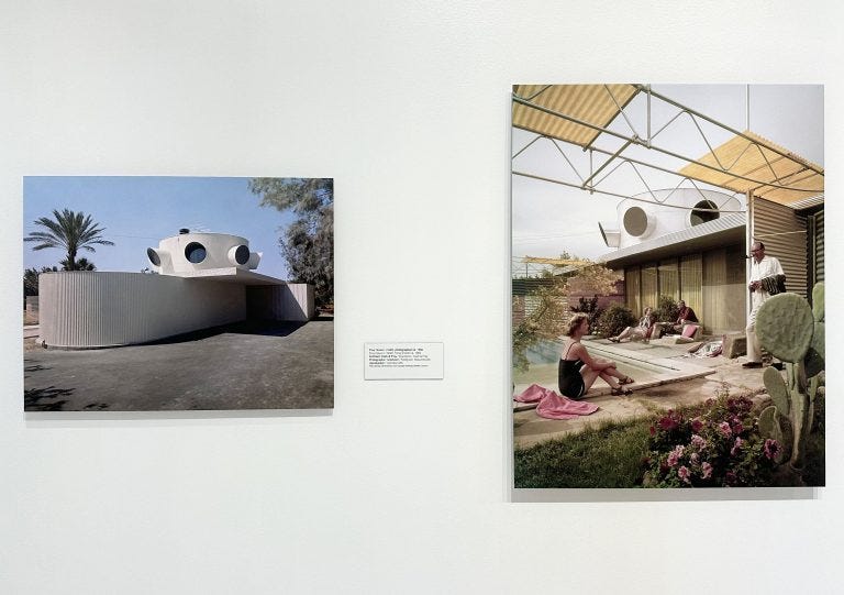
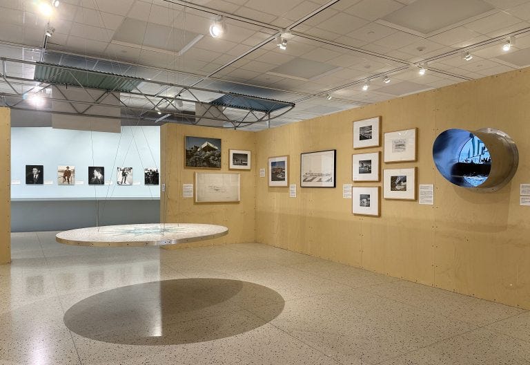
At Palm Springs Art Museum’s Art and Design Center, it was the last week to see Albert Frey: Inventive Modernist. The exhibition traced his life and career from Europe to the U.S. and included many vintage photographs of his work, with an emphasis on what he built in Palm Springs.
In the place Frey would call home for the rest of his life, he created his own version of Mid Century Modernism, referred to as “Desert Modernism”. This style uses clean lines and simplicity, and aims to incorporate nature by blending indoor and outdoor spaces. This article on two of his houses goes into more detail.
The quote below, from a letter Frey wrote to Le Corbusier, his mentor, in 1935, emphasizes the inspiration he found in this new location, and was included in the exhibition-
“….the sun, the pure air and the simple forms of the desert create perfect conditions for architecture.”
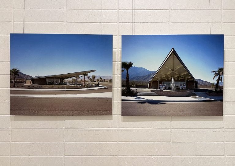
Many of his structures can still be found in Palm Springs- including the Visitor Center. Housed in the former Tramway Gas Station, it can be seen on your way into the city along N Palm Canyon Dr. It shows the influence of nature in Frey’s work, but in a different way.
From the museum-
At the same location where some 23 years earlier Clark & Frey had designed the graceful stone entry gates to Palm Springs, Frey created another welcoming structure-the Tramway Gas Station, a bold and assertive monument. Architecturally speaking, its roof offers a hyperbolic paraboloid design. Its cantilever suggests a spectacular soaring bird and indicates that visitors were entering a decidedly mid-century modern, forward-thinking city. About its genesis Frey said, “When you think about what nature produces in fantastic forms, in birds and animals-that’s where creativity comes in.”
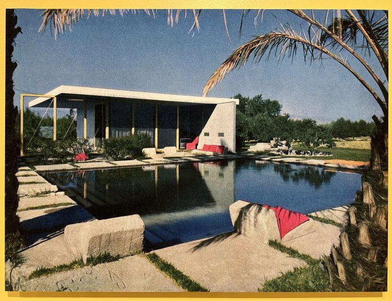
Frey’s Aluminaire House, originally built in 1931, was recently rebuilt next to Palm Springs Art Museum and unveiled this year. Constructed using mostly aluminum and glass components, it was the first all metal house made in the U.S. and was originally intended to be mass-produced and affordable.
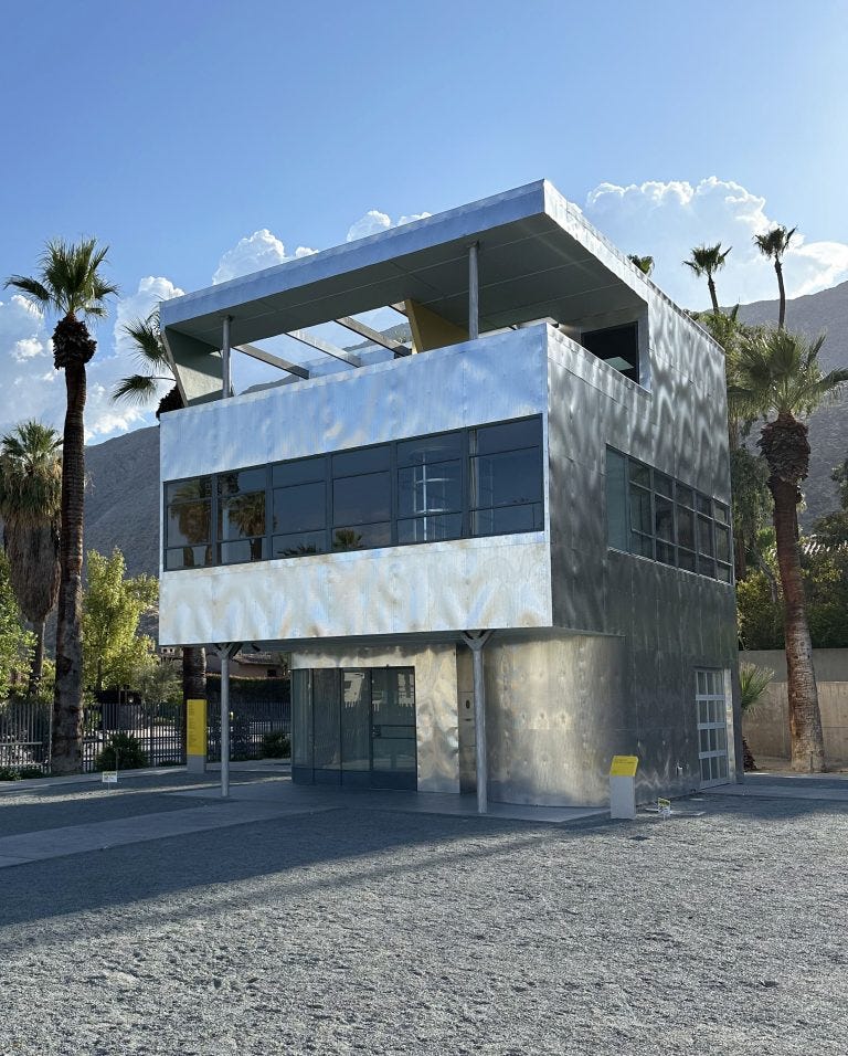
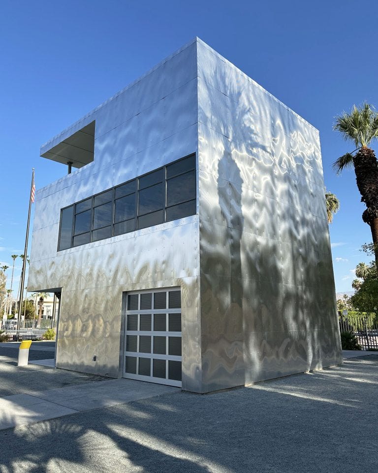
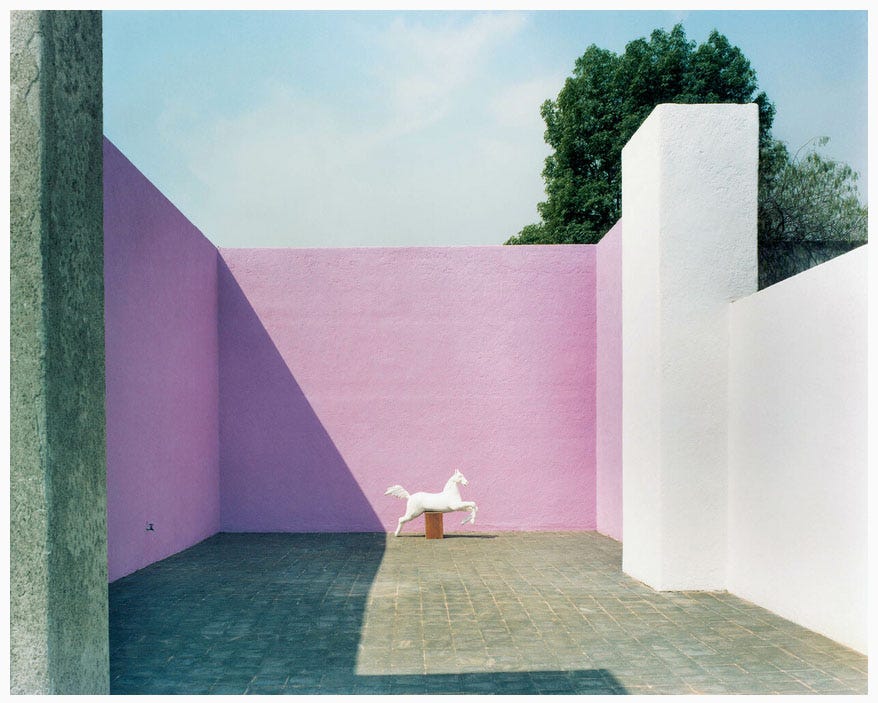
Aluminaire House is silver, with the only color coming from reflections. Mexican architect Luis Barragán, part of the Modernism movement and also influenced by Le Corbusier, often used color- in both the interiors and exteriors of his structures- adding to what he referred to as an “emotional architecture”.
From Wikipedia about the influence of modernism on Barragán and his concept of “emotional architecture“-
Barragán visited Le Corbusier and became influenced by European modernism. The buildings he produced in the years after his return to Mexico show the typical clean lines of the Modernist movement. Nonetheless, according to Andrés Casillas (who worked with Barragán), he eventually became entirely convinced that the house should not be “a machine for living.” Opposed to functionalism, Barragán strove for an “emotional architecture” claiming that “any work of architecture which does not express serenity is a mistake.” Barragán used raw materials such as stone or wood. He combined them with an original and dramatic use of light, both natural and artificial; his preference for hidden light sources gives his interiors a particularly subtle and lyrical atmosphere.
Just scrolling through the images of his home, you can see how well he achieved these intentions. (additional images here and here)
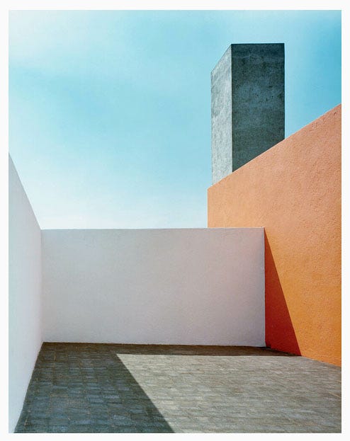
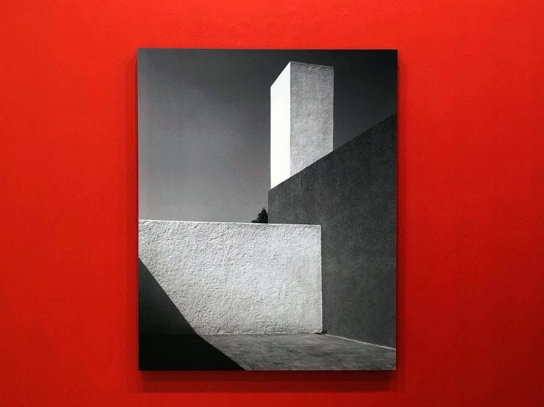
Armando Salas Portugal, who took the picture above, is known for his photographs of the Mexican countryside as well as the architecture of the city. He captured the work of several famous architects, in addition to Luis Barragán’s projects.
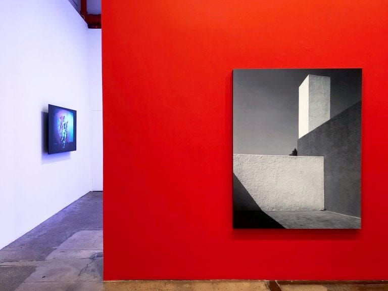
Terence Gower used a version of Portugal’s photograph above in El Muro Rojo (Barragán), 2005- part of the group exhibition Color Effects at Galerie Lelong in NYC last year- to explore modernism, architecture, and color.
From the artist’s website explaining the work-
A large black and white photograph of the roof patio of the Casa Barragán is mounted on an enormous red wall. The photograph is a copy of Armando Salas Portugal’s famous 1953 photograph (this time commissioned from architectural photographer Jorge del Olmo), and shows a corner of Luis Barragán’s roof patio with its famous coloured walls reduced to grey tones. The work separates a tonal and planar understanding of the architecture from the “emotional” encounter with colour that Barragán aspired to.
From his statement about his practice-
I work on a number of bodies of work at once, each developed over several years. In the past decade my work has focused on a critical re-reading of the modern movement and its utopian bent. A desire to reexamine the notion of progress—a term corrupted by the excesses of technological modernism—has fueled my research on the post-war period and has led to a search for models from the past that might still be relevant today.
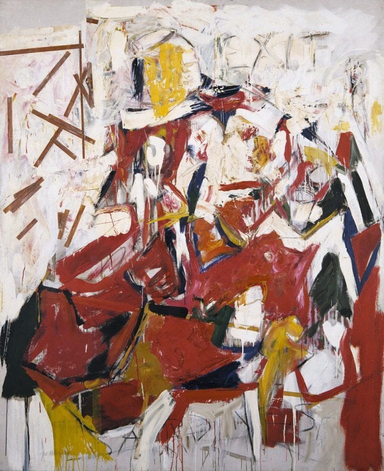
The pink in the photo of the roof terrace from Casa Barragán (image at the top of the newsletter) is also known as rosa mexicano, or Mexican pink- inspired by the color of bougainvillea flowers. It increased in popularity when artist and fashion designer Ramón Valdiosera used it as the central color in one of his fashion shows in 1949.
Below is another use of the color on a wall in the sculpture garden at MOLAA, the Museum of Latin American Art in Long Beach, CA.
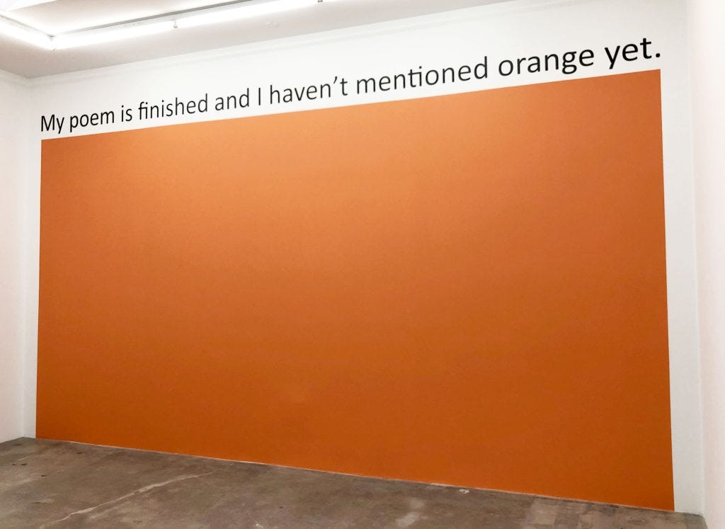
Thinking about walls of color reminded me of Haim Steinbach’s mypoemisfinishedandIhaven’tmentionedorangeyet, 2019, from his exhibition Appear to Use at Tanya Bonakdar Gallery in Los Angeles that same year.
From the press release-
Holding a wall of the back gallery is an expansive wall painting consisting of the color orange along with the line—mypoemisfinishedandIhaven’tmentionedorangeyet—from the poem “Why I Am Not a Painter” by Frank O’Hara. Here, Steinbach challenges our perception of architecture in the relationship between language, color and cultural structures, encompassing the core themes of the exhibition.
Here is the Frank O’Hara poem being referenced-
I am not a painter, I am a poet.
Why? I think I would rather be
a painter, but I am not. Well,for instance, Mike Goldberg
is starting a painting. I drop in.
“Sit down and have a drink” he
says. I drink; we drink. I look
up. “You have SARDINES in it.”
“Yes, it needed something there.”
“Oh.” I go and the days go by
and I drop in again. The painting
is going on, and I go, and the days
go by. I drop in. The painting is
finished. “Where’s SARDINES?”
All that’s left is just
letters, “It was too much,” Mike says.But me? One day I am thinking of
a color: orange. I write a line
about orange. Pretty soon it is a
whole page of words, not lines.
Then another page. There should be
so much more, not of orange, of
words, of how terrible orange is
and life. Days go by. It is even in
prose, I am a real poet. My poem
is finished and I haven’t mentioned
orange yet. It’s twelve poems, I call
it ORANGES. And one day in a gallery
I see Mike’s painting, called SARDINES.
And the painting by Goldberg he’s referencing-
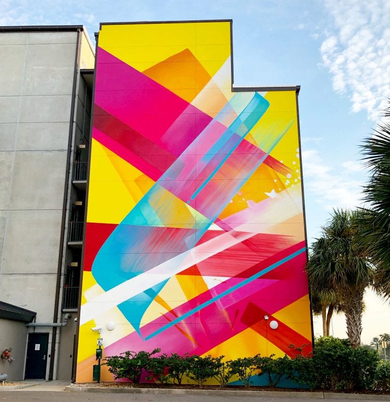
This week’s mural is the bright and colorful wall created by Claudia Walde, aka MadC, for the 2022 edition of SHINE Mural Festival in St. Pete, Florida.
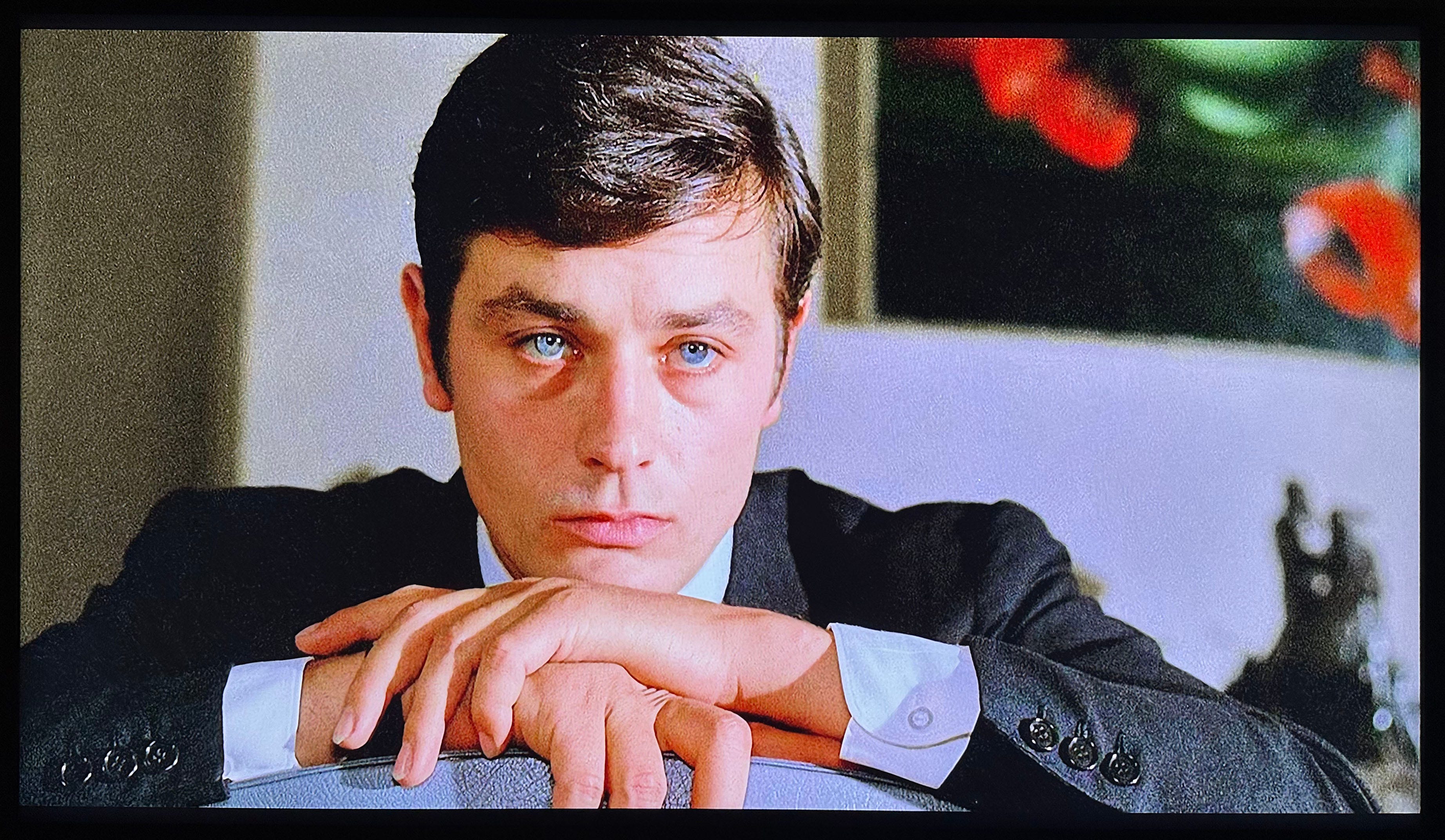
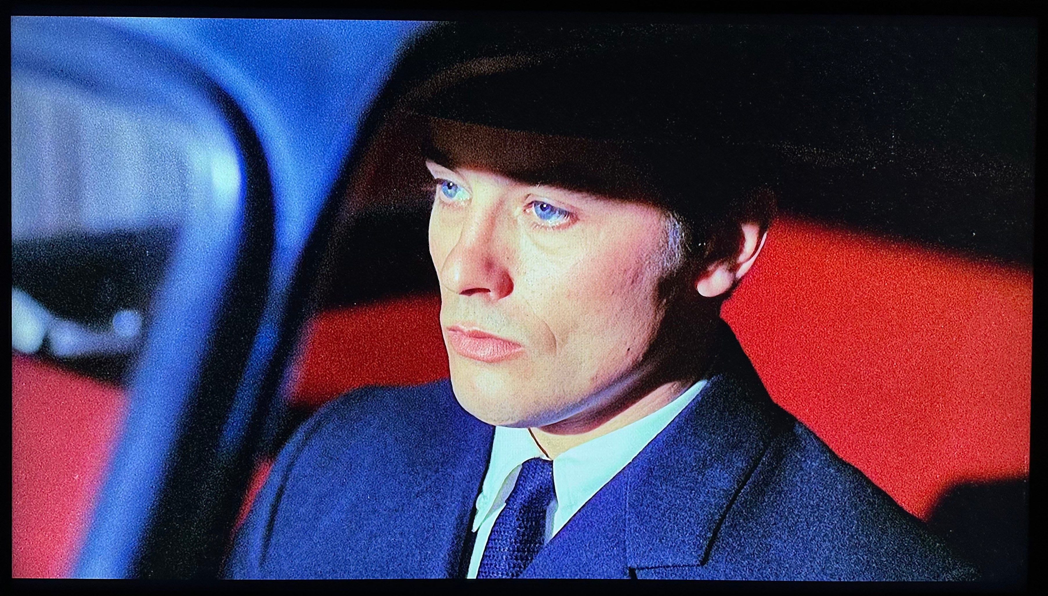
After posting about Nico last week and learning about her relationship with Alain Delon, he was fresh on my mind when he sadly passed away on Sunday. I’d never seen his films, so I started with Le Samourai (1967), in which he plays a paid assassin trying to find out who has been sent to kill him. He remains stoic and mostly silent throughout the film, but that aspect holds your attention- as does the use of color in several of the scenes.
Finally, Los Angeles band The Velvet Starlings recreate a 60s vibe in their song below, Colours on the Canvas from their 2021 album, Technicolor Shakedown.
Until next time- Hope your week is filled with plenty of vivid color!